Why Good Design Shouldn’t Look Like Everyone Else
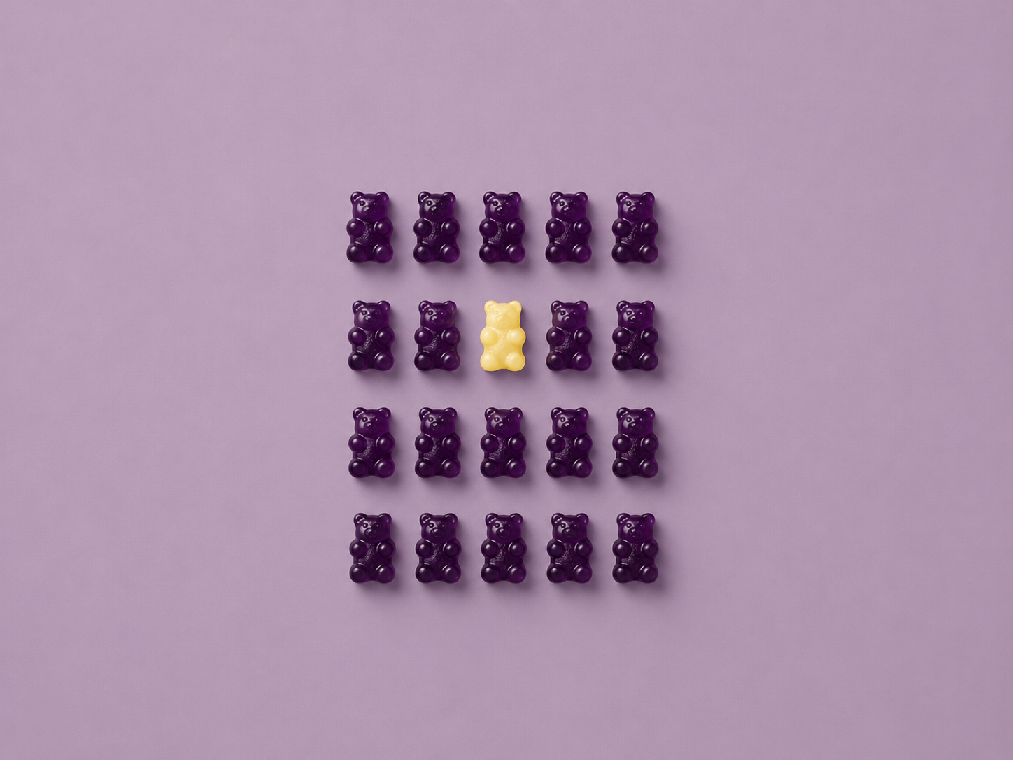
Polished work is easy to find. Personality is a lot harder.
It has been a while since I have written here! Between working full-time, and going back to school, I had to take a small step back from Celestial Bear Design. Even when I haven't been posting content here or writing about design though, I have obviously still been surrounded by it. I design for work, I still design for a few clients, I still make art, I study art, and, like most people, I spend unreasonable amounts of time looking at art and things other people have designed.
Lately, there is something I keep coming back to and thinking about how to express in a way that was clear and understandable to others. That thought is that a lot of design looks really good right now. However, a lot of it also looks exactly the same. That might sound kind of contradictory, but I don't think it is. Something can be beautifully executed and still be just another design in a sea of designers following what the current trend and style is. The typography can be clean, the colors can work together, the illustration can be polished., the layout can be balanced, and it can still be completely forgettable. That is because polish and personality are not the same thing.
Good design isn't just about being different
There is an important distinction here, I know I am saying personality is important for good design but I don't think good design needs to be bizarre, experimental, or different simply for the sake of being different. If a design is so unusual that no one understands what it is communicating, being original hasn't accomplished much. There has to be a balance between personality and polish.
There is also a difference between being different and being distinctive. Research by Jenni Romaniuk, Byron Sharp, and Andrew Ehrenberg challenged the traditional marketing assumption that successful brands need consumers to perceive them as fundamentally different from their competitors. Their research instead emphasized the importance of distinctiveness: building recognizable associations that help people identify a brand. That distinction makes a lot of sense from a design perspective.
A bakery does not need to invent an entirely new visual language for baked goods. A children's brand does not need to avoid bright colors because other children's brands use them. A travel company does not need to pretend airplanes, maps, or luggage no longer exist because competitors use those images too. The question is what you do with those ingredients. What colors become yours? What kind of illustration feels like you? What shapes keep appearing? How does your typography behave? What does your photography feel like? What kind of personality does your packaging have? You don't need to make something no one has ever seen before but you need to make something that doesn't feel like it could belong to just anyone.
The problem with designing for the trend instead of the project
Trends are not inherently bad but they do change frequently. Designers have always responded to the visual language around them. Art movements influence one another. Technology changes what is possible. Fashion, interiors, advertising, packaging, and graphic design constantly borrow ideas from each other. Sometimes a trend becomes popular because it genuinely works. The problem starts when the decision-making process becomes: “This is what everyone is doing right now, so this must be what this project should look like.”
That skips one very important question: Why?
Why is this the right color?
Why this typeface?
Why rounded corners?
Why hand-drawn illustration?
Why minimalism?
Why maximalism?
Why that photography style?
Why that packaging structure?
Why should this particular business, product, or message look this way?
If the only answer to any of these questions is “because that's what's popular,” the design has probably stopped being about the project and has shifted to what is the latest trend, and trends move quickly. When enough businesses adopt the same visual language, something that once felt fresh can start to feel like a default. That doesn't necessarily make the individual designs ugly. In fact, the opposite is often true. They are perfectly nice. They are just hard to remember and become a “Me Too” rather than its own design. Also, depending on how quickly your product or design joins the trend, you could be jumping into an already phasing out trend when a new trend is already on the rise.
“Pretty” and “purposeful” aren't the same thing
This may be one of the hardest parts of design to explain because “pretty” is so easy to recognize. You can look at something and immediately decide whether you like the way it looks. Purpose is more complicated. Nielsen Norman Group describes visual design as doing more than making something aesthetically pleasing. Thoughtful visual design can affect usability, emotion, and brand perception. That is closer to how I think about design. A project doesn't exist in a vacuum, it has an audience, a purpose, and has something it needs to communicate or accomplish. Sometimes the prettiest solution is also the right solution but sometimes it isn't. A perfectly polished 3D character might technically be more impressive than a scribbly little hand-drawn mascot, but if the brand needs to feel approachable, quirky, homemade, or slightly silly, that scribbly character might be doing a much better job. A sophisticated neutral color palette can look gorgeous, but if the product needs to grab attention from twelve feet away on a crowded retail shelf, subtlety might not be doing it any favors. An elegant typeface can be beautiful but does not mean it belongs on every luxury product. The question isn't simply: “Does this look good?” It is:“Does this communicate what it needs to communicate, to the people it needs to reach?”
Sometimes the imperfections are the personality
One of the things I find myself doing when I illustrate lately is actually keeping some of the little imperfections that happen when I am drawing. Not because I am lazy and don’t want to fix it but because it ends up being a small way to give more humanity to the art. A line keeps a little bit of its roughness rather than being completely smoothed out and perfect. Though it might be mostly symmetrical there are some small differences that probably only I would really notice to be honest. A texture might be a little uneven, or lettering gets adjusted by eye instead of being left mathematically perfect. There is a point where removing every irregularity can also remove some of the character.
There is even research suggesting that people can respond positively to signs of human making. A 2015 Journal of Marketing study examined what researchers called the “handmade effect.” Across four studies, products identified as handmade were evaluated more positively in certain contexts, with the researchers finding that people associated handmade production with the maker's care and human involvement.
That study was about handmade products, not whether every wobbly line makes a design better. It would be a mistake to stretch the findings that far, but I do think it illustrates something interesting: We notice evidence of people. A brushstroke can tell us something, so can irregular lettering, an unusual color combination, a strange little character, or an illustration that clearly came from someone's hand rather than a perfectly standardized library or a prompt placed into an AI system.
Imperfection isn't automatically good design either though. There is a major difference between an intentional irregularity and something that is simply poorly made or rushed. The skill is knowing which imperfections to keep in a design to give something character, and which ones are going to take away from the design.
The tiny decisions are usually the design
When people outside the design world see a finished piece, they usually don't see the hundreds of tiny decisions that created it. They see the result. Designers see all the questions and thoughts within it that led to that finished piece.
Should this type be heavier? Lighter?
What happens if there is more space here?
Does this red need to be warmer?
Is the illustration/image competing with the headline?
Is the hierarchy obvious?
Does this feel too serious? Does it feel too silly?
Is everything becoming too symmetrical?
Does the packaging still work from across the room?
Can I remove this?
Should I add something?
Will anyone actually know what they are supposed to look at first?
None of those decisions are particularly dramatic on their own but together, they become the design. Typography, color, scale, alignment, hierarchy, imagery, contrast, spacing, and composition all influence the way information is perceived. Visual-design guidance from Nielsen Norman Group similarly emphasizes that elements such as grids, color, typography, icons, scale, contrast, and hierarchy affect more than appearance alone. This is also where professional judgment becomes difficult to automate. A tool can give you twenty possibilities but someone still has to decide which one is the right one for the project.
Which brings us to AI…
It would be difficult to talk about visual sameness right now without acknowledging AI. We are all seeing the AI generated posters rampant across social medial The use of AI has made generating polished creative material extraordinarily accessible. Templates, stock libraries, design software, and increasingly capable generative tools can all help get an idea onto the page much faster than starting completely from scratch. I have seen numerous small businesses and hopeful new businesses turning to AI to help them build out their ideas from just an idea into something they are actually starting to make progress on. I don't think designers need to pretend technology doesn't exist in order to defend the value of design. But there is an interesting tradeoff emerging around generative AI and creativity.
A 2024 study published in Science Advances found that access to generative-AI ideas could improve the creativity of individual participants' short stories, particularly for people who initially scored lower on creativity. At the same time, the AI-assisted stories became more similar to one another, reducing the collective diversity of the group. That experiment studied writing, not graphic design, so it doesn't prove that AI-generated visual work will necessarily behave the same way, but the tension it identified is worth paying attention to:
Something can help individuals produce stronger results while simultaneously making the overall pool of work more similar. That feels very relevant to design. If thousands of people use similar tools, similar prompts, similar templates, similar references, and similar definitions of what looks “professional,” the resulting sameness shouldn't be particularly surprising. I don't think that necessarily makes AI the villain. The same thing can happen with stock photography, Canva templates, when everyone saves the same Pinterest inspiration, when every designer follows the same trend report, and even happen when human designers spend too much time looking at other designers. AI simply makes producing options much faster, and that makes judgment even more important. A generated image can be raw material just like a stock illustration, a template, or a trend can be raw material. The mistake is assuming that the starting point is automatically the solution rather than finding ways to improve the starting point.
This matters outside of branding
I talk about brands a lot because branding provides an easy example, but the same issue appears almost everywhere design does. Think about walking down a retail aisle. Imagine ten products using similar colors, similar type, similar patterns, similar photography, and similar packaging because each company independently decided that this was the current look for the category. Every product might be attractive individually but put them next to one another and suddenly none of them has much of a voice.
The same can happen with home goods, textile patterns, websites, advertisements, social graphics, book covers, character design, product packaging, and even the products themselves. When every creative decision is based on what is already succeeding somewhere else, eventually everything starts circling the same visual center and starts to look very similar. This is why I don't think originality means refusing inspiration but knowing how to balance inspiration and originality. Design has always been built from things that came before it. Originality is what happens after the inspiration. It is the combination of elements, the editing, the judgment, the strange little decision that technically wasn't necessary but somehow made the whole thing work. It is taking familiar ingredients and turning them into something specific.
Knowing when not to follow the trend is part of being a designer
Designers should know what is happening visually around them. We should understand trends. We should understand new technology. We should understand what audiences are responding to and how expectations are changing, but understanding a trend and automatically following it aren't the same thing. Sometimes the professional decision is to use the trend. Sometimes the professional decision is to ignore it. Sometimes it is to take one small piece of it and reinterpret it. Sometimes it is to tell a client, “Yes, I know everyone is doing that right now. I don't think it's right for you.” That isn't resistance to change, that's design. Because the designer's job was never simply to know how to operate the software. The job is making decisions.
So how do you know if your design is distinctive enough?
There are a few simple questions I like to help identify if something is distinctive:
If you removed the logo, who would this belong to?
Could someone still recognize the brand?
Does the product still have a personality?
Would the advertisement still sound and look like the same company?
Would the illustration still feel like it came from the same world?
Or could you replace the logo with three competitors' names and nothing would feel particularly strange?
That doesn't mean every element needs to scream for attention. Distinctiveness can be subtle. It might be a particular color relationship, style of photography, illustration technique, recurring shape, an unusual composition, specific voice, character, texture, way of using type, whatever your unique element is but something should feel owned. Research on brand distinctiveness makes a similar distinction. Being identifiable can matter even when consumers don't perceive a brand as fundamentally different from every competitor. That is why consistency matters too. The goal isn't to reinvent yourself every time you design something. In fact, that would defeat the purpose. You want variety within an identity, not a new identity every Tuesday.
Polished has gotten easier. Distinctive hasn't.
Maybe that's the thought I've been trying to put into words? We have more tools than ever for making things look good, and that's a good thing, but as technically polished work becomes easier to produce, polish alone becomes less useful as a measure of good design. The harder questions are still there.
Does it have a point of view?
Does it communicate?
Does it fit the audience?
Does it solve the problem?
Does it feel intentional?
Does it feel like someone made choices?
Does it feel like it belongs to the person, product, or brand it was actually created for?
Good design doesn't need to look like nothing we've ever seen before. It just shouldn't look like it could belong to everyone else. After a very busy stretch of work, school, art, and everything in between, that feels like an appropriate thought to return to this blog with. I'm looking forward to writing here again!
I would love to hear your thoughts on the question of distinctiveness vs following the trends so comment below with your thoughts!
Sources
Romaniuk, J., Sharp, B., & Ehrenberg, A. (2007). Evidence Concerning the Importance of Perceived Brand Differentiation. Australasian Marketing Journal, 15(2), 42–54. The study examined perceived brand differentiation across multiple categories and argued for greater emphasis on distinctiveness and brand identification.
Fuchs, C., Schreier, M., & Van Osselaer, S. M. J. (2015). The Handmade Effect: What's Love Got to Do with It? Journal of Marketing, 79(2). Across four studies, the researchers found evidence of a positive “handmade effect” on product attractiveness and investigated perceptions of human care as an underlying mechanism.
Doshi, A. R., & Hauser, O. P. (2024). Generative AI Enhances Individual Creativity but Reduces the Collective Diversity of Novel Content. Science Advances, 10(28). The experiment found that access to generative-AI ideas could improve evaluations of individual creative writing while making outputs more similar to one another overall.
Gordon, K. (2022). Visual Design in UX: Study Guide. Nielsen Norman Group. The resource summarizes research and guidance on visual hierarchy, typography, color, grids, imagery, accessibility, aesthetics, and the relationship between visual design and user experience.