Celestial Bear Design
Project Portfolio
Your story deserves to be told in a way that captivates and connects.
Additional portfolio content is available upon request. While some of my projects are restricted from public display, I maintain an extensive private portfolio of packaging design, website development, and brand collateral work. I'm happy to share detailed examples and case studies in a confidential setting.
Please contact me to learn more.

Recent Projects
-
![Colorful business cards for "Reserva De Rodriguez" featuring a vibrant illustration of a woman with roses, surrounded by fresh tomatoes, chili peppers, a green pepper, garlic, and cilantro on a wooden surface.]()
Reserva De Rodriguez Business Cards
Custom Business cards for Reserva De Rodriguez - Beautiful business cards with a vibrant look to match the vibrant and amazing personality of the woman they are for!
-
![Business cards with 'Fast Freddy Vigil' on a table beside a disco ball and CDs.]()
Fast Freddy Business Cards
Fast Freddy Business Cards - An edgy and modern look for these cards to match the professionalism and style of this DJ.
-
![A small mouse sitting with a glowing light under a group of mushrooms in a dark, forest-like setting.]()
Little Mouse
A little illustration of a mouse using a photo for the background.


Branding
-
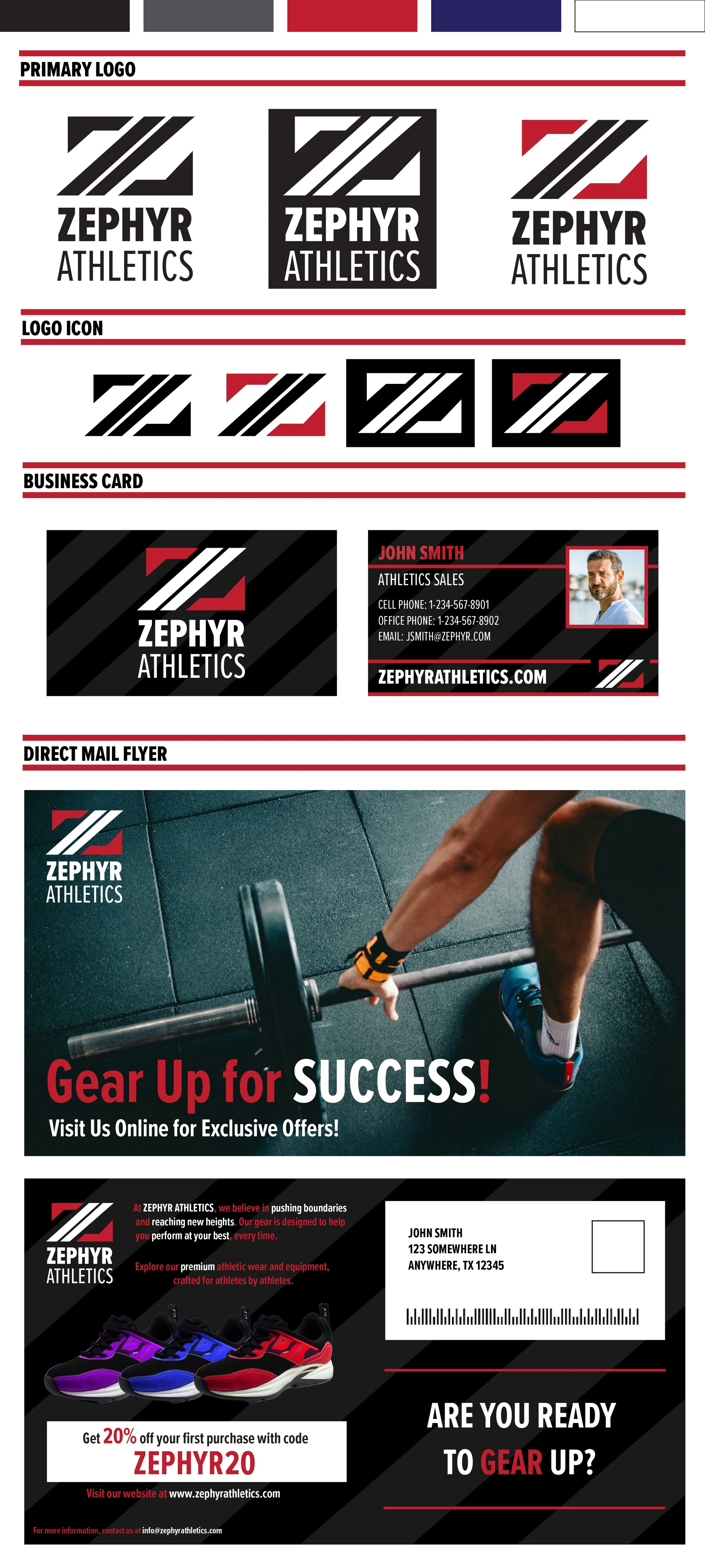
![Branding materials for Zephyr Athletics including primary logo, logo icon, business card, and direct mail flyer showcasing athletic gear and promotional offers.]()
Zephyr Athletics
A dynamic branding exploration for an imagined sportswear brand. This project demonstrates versatility through bold typography, modern logo variations, and a cohesive color palette.
-
![Branding materials for Flourish Botanicals, featuring color palettes, logos, packaging, business cards, and promotional items. Design concept includes green and natural elements. Includes mock-ups of product packaging, a promotional bag, and a poster advertising "Magnolia Bliss."]()
Fleurish Botanicals
An elegant and organic logo design for a fictional botanical brand, reflecting simplicity and nature's beauty through clean lines and a subtle color scheme.
-
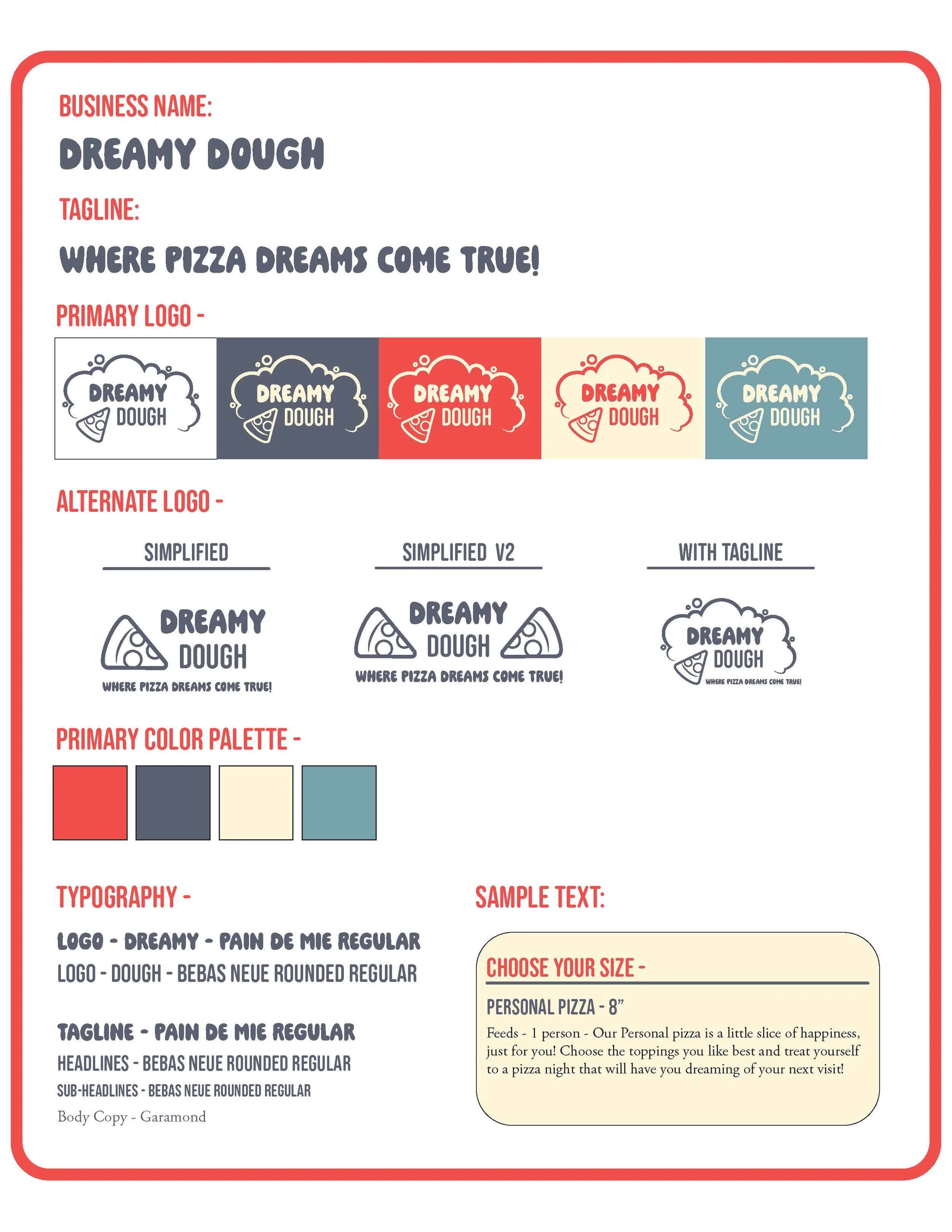
![Design board for "Dreamy Dough" with logo variations, primary color palette, and typography. Logos have pizza slice imagery and the tagline "Where Pizza Dreams Come True!" Colors include red, dark blue, cream, and teal. Typography details include "Dreamy" in Pain de Mie Regular and "Dough" in Bebas Neue Rounded Regular. Sample text describes a personal pizza option.]()
Dreamy Dough Pizza Box
A bold and playful logo designed for a fictional pizza brand, incorporating fun typography and vibrant colors to convey a sense of energy and flavor.
-
![Brand style guide for Teriyaki Park Sushi]()
Teriyaki Park Branding Kit
A comprehensive branding concept for an imagined restaurant, including logo design, color schemes, and application mockups to ensure cohesive visual identity.
-
![Logo design guidelines for "Camo to Canvas" featuring primary and alternative logos, color schemes, fonts, and usage instructions. Includes black, pink, and green colors, with different silhouette styles of a person holding an object.]()
Camo To Canvas
A mission-driven logo for a hypothetical non-profit art organization, combining strength and creativity through symbolic design elements.
-
![Kraft caramels packaging design with nutrition facts, product image, and caramel-dipped apples recipe.]()
Concept - Kraft Caramels Box
My packaging concept for Kraft Caramels in a box package design instead of the plastic bag packaging.


Packaging
-
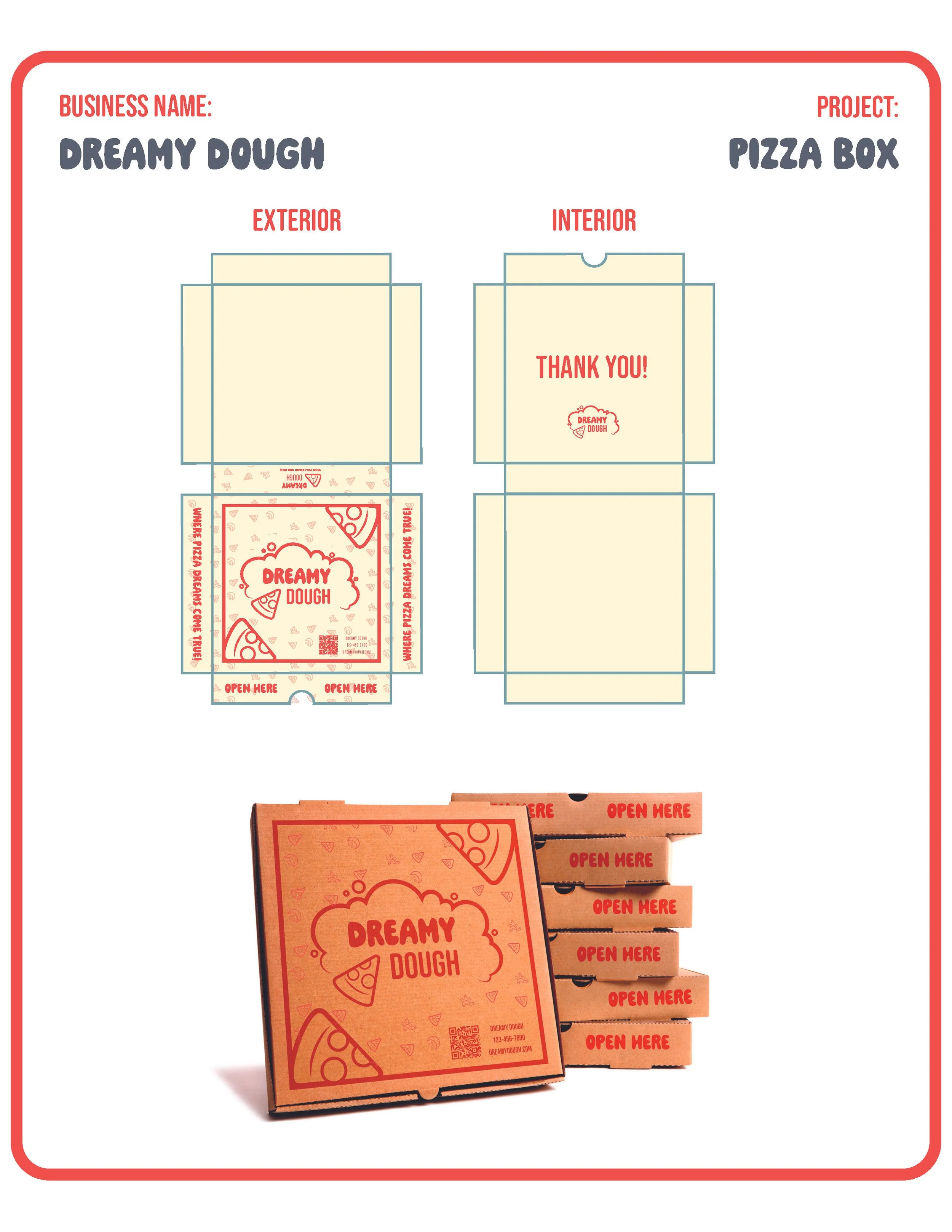
![Design layout for Dreamy Dough pizza box with exterior and interior views. Features include brand logo, text "Open Here," and instructions. Stacked and folded box shown.]()
Dream Dough Pizza Box
A practical and eye-catching pizza box design, featuring bold illustrations and branding that enhance customer experience and brand recognition.
-
![Kraft caramels packaging template, includes nutrition facts, product images, and a caramel-dipped apple recipe.]()
Kraft Caramels
Minimalist and inviting packaging concept for caramels, emphasizing rich tones and clean typography for a premium look.
-
![Packaging concept for "Flourish Botanicals" branded magnolia-scented body lotion, featuring a floral design and text layout including product name, description, and barcode.]()
Fleurish Botanicals Lotion Box
An elegant and soothing packaging design for the fictional brand Fleurish Botanicals. The design reflects the organic and nature inspired beauty of the brand while also providing important and legally required information.
-
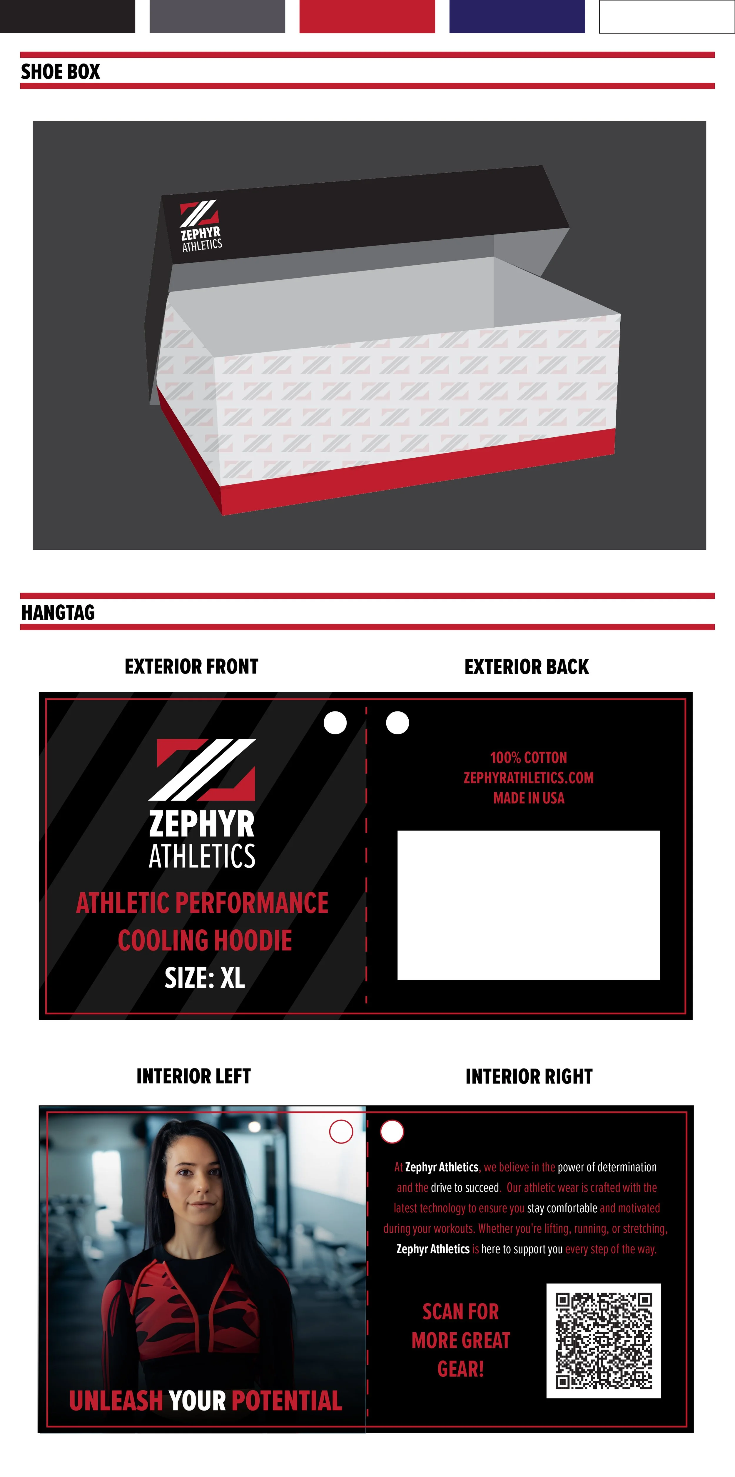
![Illustration of a Zephyr Athletics shoe box and hangtag design. The shoe box features a black lid with the Zephyr Athletics logo and a patterned body. The hangtag details an athletic performance cooling hoodie, size XL, made of 100% cotton. It includes text about the brand's commitment to quality and a QR code for more information. The interior features an image of a person wearing athletic wear with the slogan 'Unleash Your Potential.']()
Zephyr Athletics Box and Hangtag
A modern shoe box and hangtag design for Zephyr Athletics, featuring bold typography and clean, dynamic graphics. The packaging reflects the brand’s athletic energy and minimalistic style, while maintaining a sleek, professional look for both the box and hangtag.


-
![Brochure with streaming service offers, Netflix, Hulu graphics, and customer support info on a wooden background.]()
Grande Direct Mail Design (Interior)
Professional direct mail piece designed concept, combining clear messaging with modern visuals to drive engagement.
-
![Wedding invitation with flowers, beige envelope, ribbon, and pocket watch on a light background.]()
Custom Wedding Invitations
Elegant and personalized invitation designs, incorporating sophisticated typography and unique layouts to make each event memorable.
-
![Teal background with the word 'INVISIBLE' in large letters, highlighting the text "LET'S MAKE THIS INVISIBLE BATTLE VISIBLE!" followed by information about sexual assault and consent. Mentions Camo to Canvas organization and website for more information.]()
Invisible Campaign Poster
A conceptually rich poster designed to highlight an important social issue, leveraging bold visuals and impactful messaging to captivate viewers.
-
![Zephyr Athletics branding materials, including logos, business card, and promotional flyer. Features primary logo with stylized "Z" and text, business card design, and direct mail flyer with fitness imagery.]()
Zephyr Athletics Direct Mail
A modern postcard direct mail design for Zephyr Athletics, featuring bold typography and clean, dynamic graphics. The design reflects the brand’s athletic energy and minimalistic style, while maintaining a sleek, professional look .
-
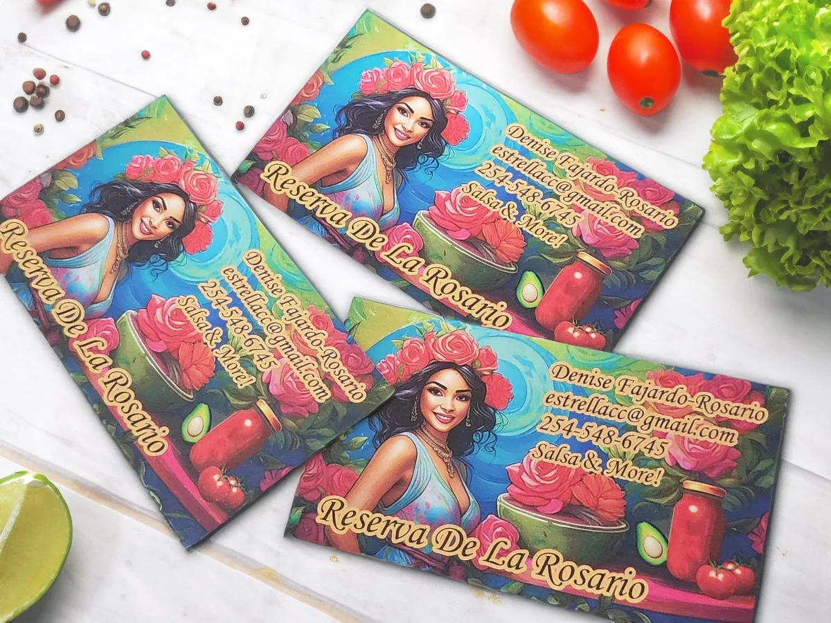
![Colorful business cards featuring a woman with roses in her hair, advertising salsa products from "Reserva De La Rosario," with contact details and assorted ingredients around.]()
Reserva De La Rosario Business cards
Creative and professional business cards for a member of the Waco community. Denise was an absolute joy to work with and these business cards are just a start on showcasing her amazing skills and personality!


Digital Media
-
![A cat jumping in a grassy landscape during sunset with a lightning storm in the background.]()
Storms To Sunshine
A photo edit combining two landscape images and an image of a cat.
-
![A child in a green coat reaches out to a glowing jellyfish in a dark forest, surrounded by faintly illuminated jellyfish.]()
Photo Mash-up: Spirits
An eerie but innocent image created meshing the forest, jellyfish, and little girl images.
-
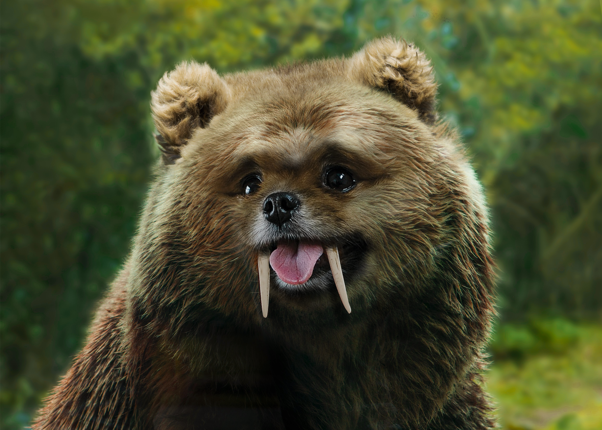
![Furry creature with bear-like features and long tusks standing outdoors.]()
Photo Mash-up: Bear, Pomeranian, and Walrus
An adorable photo mash-up using images of a brown bear, Pomeranian, and walrus tusks.
-
![Rusty metal surface with rivets and the word 'RUST' oxidized into the surface.]()
Rust = Text Overlay
Creative use of multiple photos, effects, and mask techniques to create a unique visual.
-
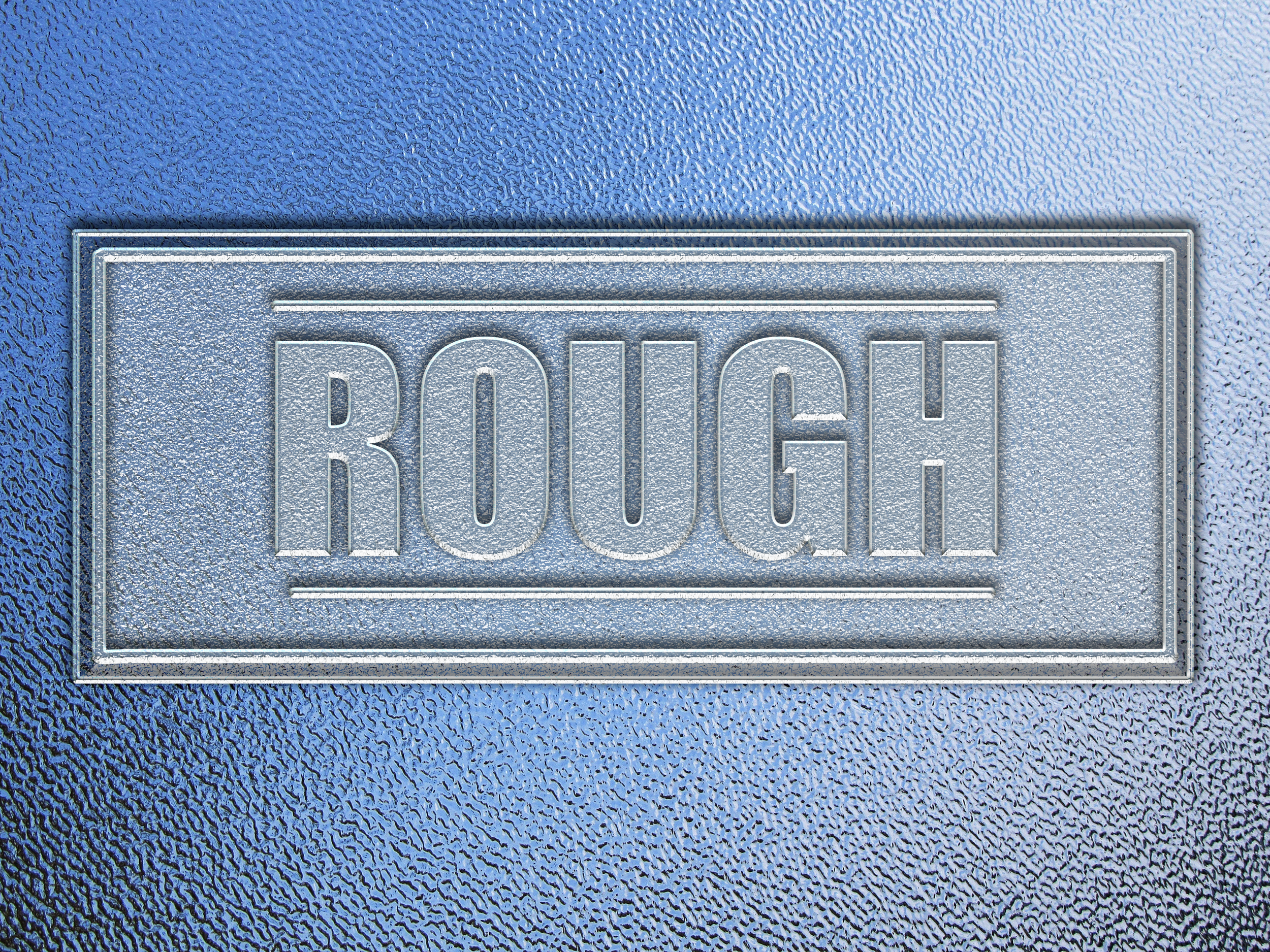
!["Rough" embossed text on metallic surface with textured blue background.]()
Rough - Texture Creation
Unique text effect using a combination of drop shadows, texture, bevel, and emboss effects.
-
![Printable appointments calendar template with empty grid, pastel pencil and heart background, fields for month and year.]()
Bullet Journal Calendar
Creative and functional bullet journal templates designed for digital use, offering customizable layouts for organization and productivity.
-
![Monthly exercise tracker template with circles and lines for notes, featuring a pastel background of kettlebells and hearts.]()
Bullet Journal Exercise Tracker
Creative and functional bullet journal templates designed for digital use, offering customizable layouts for organization and productivity.
-
![Jelly bean-shaped spaces on colorful smiley face background for writing affirmations, titled 'Jolly Jelly Beans of Affirmation.' Includes instructions to write positive affirmations and a section for month and year. Text reads 'Time For Some Positivity!']()
Bullet Journal Affirmations Template
Creative and functional bullet journal templates designed for digital use, offering customizable layouts for organization and productivity.
-
![Monthly spend tracker template with sections for category, total spent, need vs. want, against a background of piggy banks and coins.]()
Bullet Journal Spend Tracker
Creative and functional bullet journal templates designed for digital use, offering customizable layouts for organization and productivity.
-
![Illustration of a fearsome dragon amidst fire with the text "Fear does not stop death. It stops life."]()
Fear Does Not Stop Death
Description goes here


Social Media
-
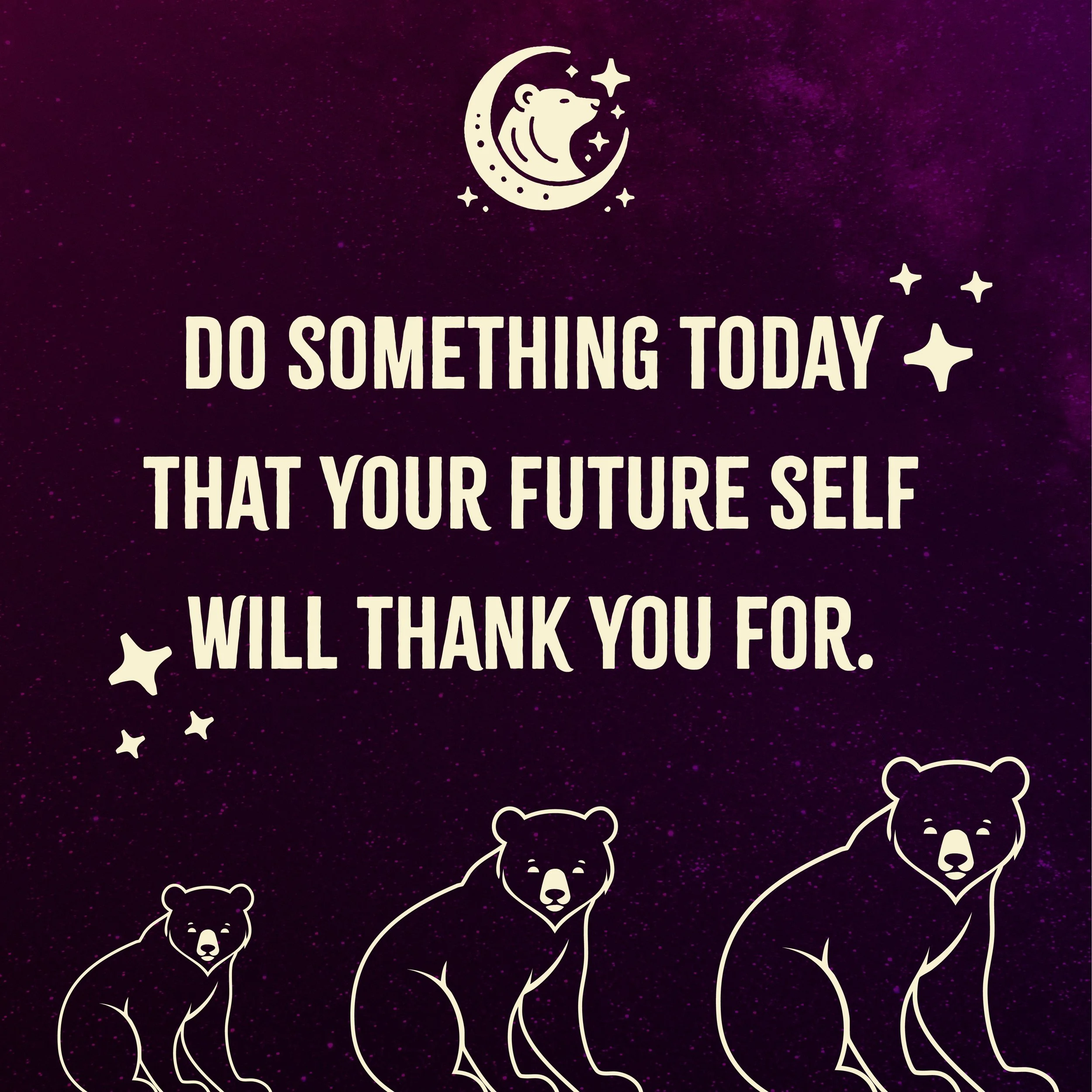
![Inspirational quote "Do something today that your future self will thank you for" on a purple background with moon, stars, and bear illustrations.]()
Social Media Post with Quote
-
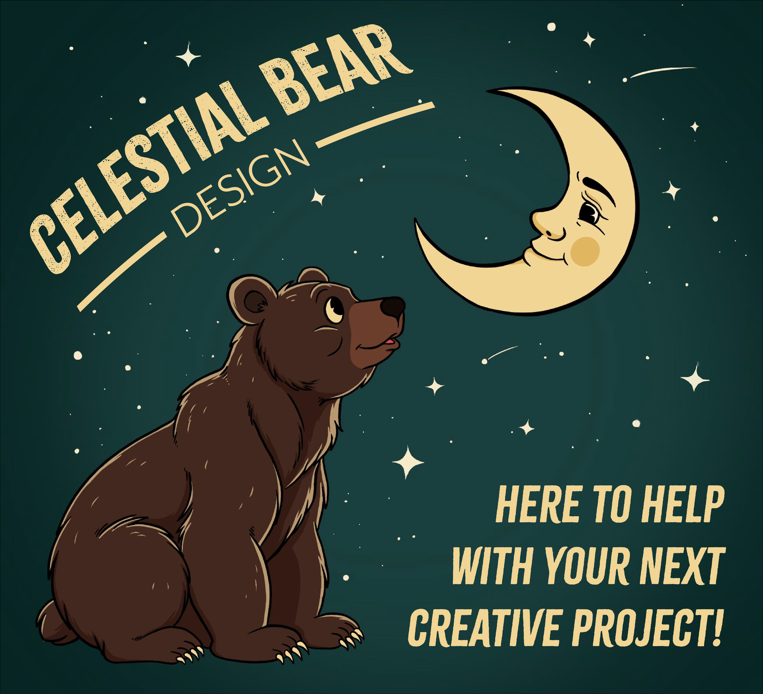
![Illustration of a bear looking at a smiling crescent moon with text "Celestial Bear Design" and "Here to help with your next creative project!" on a starry night background.]()
Social Media Post with Illustration
This social media post combines my graphic design and illustration skills.
-
![Zephyr Athletics promotional material featuring an envelope design and a social media style advertisement with a woman in athletic wear. The ad includes text promoting fitness goals and Zephyr Athletics gear, highlighting quality materials and comfort. The slogan 'Unleash Your Potential' is prominent.]()
Zephyr Athletics
Engaging digital graphic tailored for Zephyr Athletics social media platforms.
-
![Poster with text promoting a weekly blog post titled "Personalized Design for 2025: Trends and Tips for Small Businesses" on a celestial background, directing readers to visit 'celestialbeardesign.com.']()
Social Media Blog Post Announcement
A beautiful and structured template that is used to provide updates on the latest blog posts made.
-
![]()
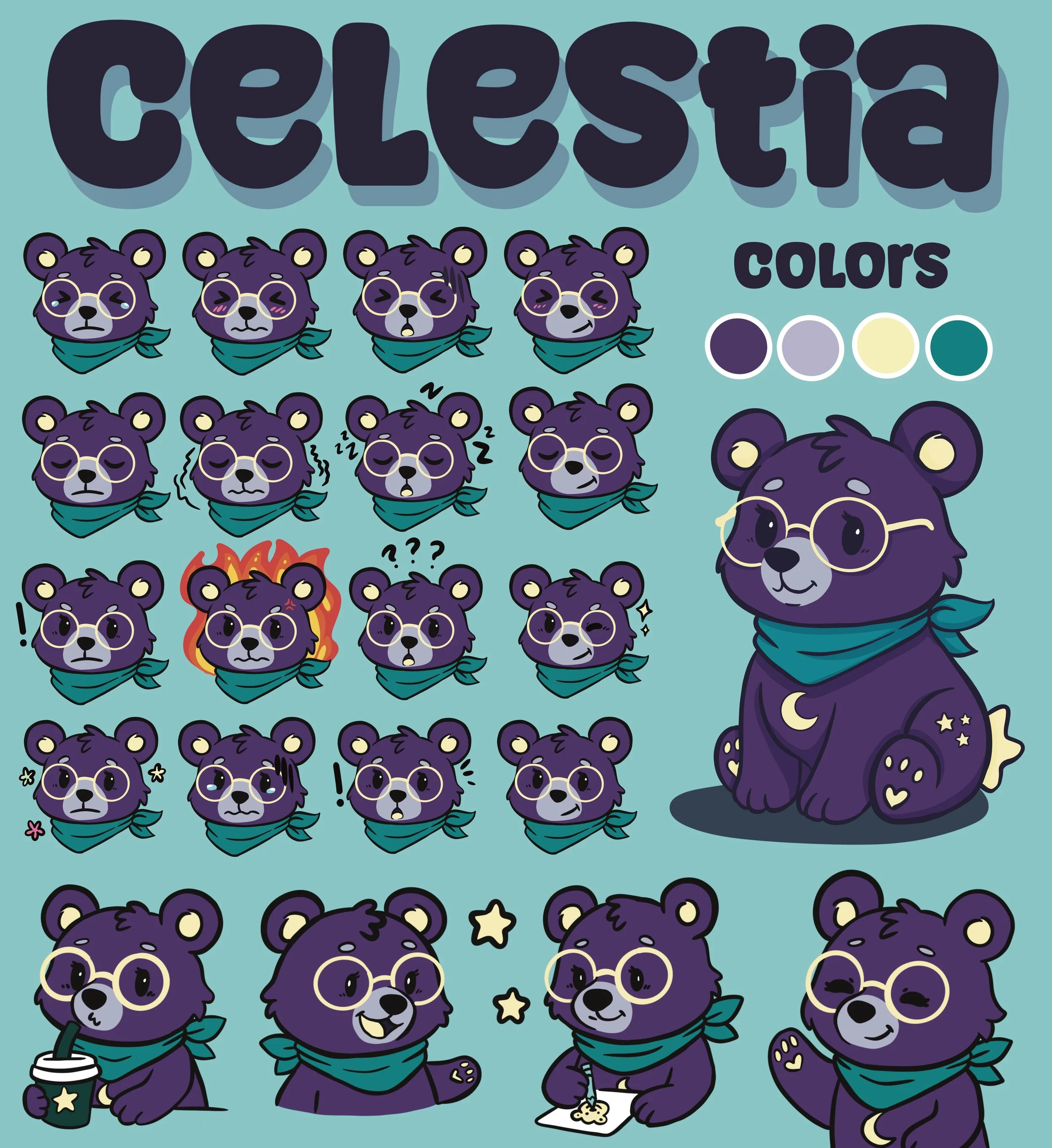
Celestial Bear Design Mascot - Celestia
To add a little more personality to Celestial Bear Design I created Celestia! My adorable little bear mascot!